Pantone® Matching System: What is it? How to Use it?

Gustavo Baner
Team ColorCopiesUSA.cominfo@colorcopiesusa.com
1-877-421-0668
Date Published: 2010-03-10// Updated: 2021-1-1
What is the Pantone Matching System (PMS) useful for?

How would you describe a color?
How would you describe a color to your graphic artist so that he/she can match it? How would you let your print provider know how the color on a printed piece should look like? How could you tell if the printed color is "right" or "wrong"?
The common language between clients, artists, and printing companies is the Pantone Matching System, most of the time called "PMS". This "language" created a color standardization system that helps in color identification and matching.
Pure, Solid, or Spot Colors: To make things a bit more complex, it is important to keep in mind that there are "pure" colors; meaning colors that are obtained out of a mineral, pigments, or manufacturing a process. When you look at the ink used to produce the color charts, you actually see the color. Because one ink produces one color, these are known as "Solid or Spot Colors". The swatch books for spot colors show what a certain ink should look like when printed.
The Magic of Color: PMS colors are achieved with just one ink while 4-color Process requires 4 inks to get an "imperfect" color

with a different printing method
Full-Color Process Printing: There are other colors that are achieved through the process of "Color Process Printing". In this method, a combination of just four inks, cyan, magenta, yellow and black, can generate a large gamut of colors. Those colors are not achieved by mixing inks, but by printing dot after dot of one and another color. Our human eye does the trick of visualizing those dots as continuous colors.
The Magic of the Numbers: ThePantone system identifies each color with a number. That "magic" number, becomes the common language. Because the number itself does not show the color, there is just this one company in the world, Pantone, that prints the swatch books to perfection. All the colors, whatever the number, are assessed against that swatch book. Some colors, that are the foundation of the printing system such as cyan, magenta, yellow, and black are known by their names.
How do you manufacture inks in every single color?
As of 2021, there are 2,161 solid colors in a single Pantone swatch book. Of those,about1,180 colors can only be produced as solid colors and not as process 4-color printing.
How do you make each of those specific inks that are required for each color?

The Pantone Matching System is base on 14 ink colors. Mixing those colors according to a specific formula allows users to generate those 1,867 unique colors that are part of a catalog.
Formulas: Pantone Matching System combination of inks to obtain the desired color.
The "formula" needed to mix the inks necessary for a specific color are listed in the swatch book. Here is one example of what it looks like:

Is choosing the "right ink" enough to get the expected color?
Getting the expected color printed is the result of many things falling in place:
- You must apply the "exact" amount of ink. More ink than "necessary" darkens the color, while less fades it.
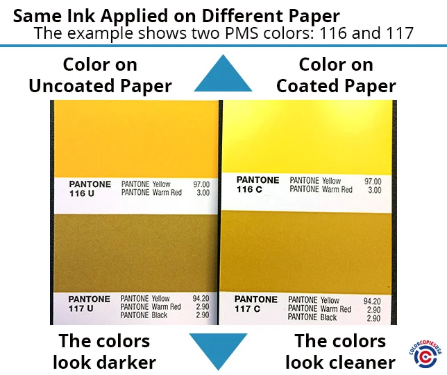
- The substrate on which you apply the ink matches the reference in your swatch book. If the same ink is applied on uncoated paper, it will look different than if it is applied on coated paper. The following image illustrates this point.

Who uses and cares about Pantone Colors (PMS)?
Color Sensitive Printing requires PMS colors Any application that requires the use of color will probably use a universal color identifies, in this case, Pantone. Here are some examples:
Manufacturers of paint or ink, for example, create their own color catalogs, but those don't necessarily match the PMS system, therefore there is a level of incompatibility between catalogs of different companies. Reproducing colors created by companies that do not go by the PMS system can be tricky.
Packaging Industry: Packaging is extremely sensitive to the selection and stability of color. Products sitting on shelves one next to the other, batch after batch should have minimal color differences. The brand owner, the graphic artists, and manufacturers will use PMS color as a point of reference.
Advertising Materials, Catalogs, and other printed products: The need for consistency is as described above. The reference of PMS colors is used in this field as well.
Garments: Screen printing uses specific inks in specific custom colors, namely PMS color. Full-color process printing is not very efficient in garments, other than with digital printing technology
Large format printing, a printing method that is used to print posters, banners, backdrops, and every sign, use this color system as well. Large format printers usually combine 6 or up to 12 single color inks to achieve every other color, so there are specific charts for large format printers.
Printed Color Vs Screen Color: There are ways to emulate the printed colors on digital screens, but the color on the screens is not absolute, because different screens, different intensities of light, and different hardware produce results that cannot be made stable or constant all along.
The colors seen on the screen do not exactly match the colors on a PMS book.
Verifying that the printed color matches the target color
Using the proper ink or combinations does not guarantee that the printed piece has the color on target.

For that reason, the specific Pantone Matching System color in the catalog, which is a very carefully crafted color swatch book, has to be compared to the printed piece.
That verification has to be done under certain light conditions. Our eyes see different colors under different illumination conditions.
A special light box that creates a certain intensity of light, of a specific kind, that is always the same, is used to make this comparison.
Can you print PMS Colors with any printing method and any printing technology?
Each printing technology uses certain types of substrates and inks. Therefore the number of colors that can be obtained varies from printing technology to another.
As described above, there are solid colors (one ink) charts and other charts that display the colors that can be produced in process color printing within a type of printing process. As an example, single color offset printing, or single color flexo printing presses could use the appropriate PMS chart designed for that specific industry.
For Process Color Printing: If the printing technology involved in digital printing or offset full-color production, a different color swatch book has to be used, which is set for a four-color process. As shown in the image above, the range of colors that can be obtained is different.
Digital Color Printing, or Laser Printing as many people call it, has its own limitations. What this means is that it is not correct to choose a color out of a solid color chart if the reproduction method will be digital color printing. The technologies are different and the colors will look different. Using the proper color catalog is paramount.
Brief Description of How the Catalog Works
The Pantone color numbers consist of a three- or four-digit number followed by the letter C, U or M, which stands for "coated," "uncoated" and "matte," respectively. There are currently1,867 colors identified in the catalog of Pantone Colors. As printing technology improves, and the gamut of printed colors widens, so does the PMS catalog, which standardizes those new colors.
It is very important to know that colors look different under different lights. All lights are not made the same. Some are whiter, and some have a yellow-tint such as candles do. In order to compare colors, the printed piece and the color chart have to be under a specific type of light, which is identify by another number, which is the "temperature" of the color.
This color-matching system is very helpful in avoiding color inconsistencies between the various types of print and digital media. The PMS was developed by Pantone LLC (Carlstadt, NJ, USA), which was acquired in 2007 by X-Rite, Inc. (Grand Rapids, MI, USA).


